
Complete Logo Reimagination Case Study
Hocking Valley Bank
Project goals
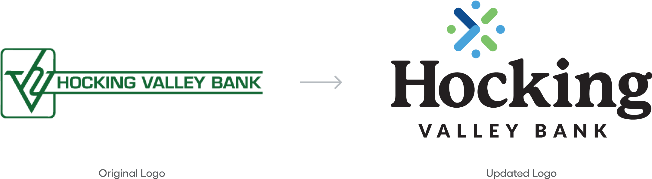
Hocking Valley Bank's original logo and branding was designed before digital spaces were recognized. We set out to give them a fresh look that would signify who they are today, while scaling the brand to be recognizable in both physical and digital spaces.
A New Brand Mark
Hocking Valley Bank needed a new logo that worked well in both digital and physical mediums, could be used effectively in different formats, and showcased the fun personality of their team.
A Reimagined Color Palette
Hocking Valley Bank's color palette needed some reworking in order to feel modern and bold – along with supporting ADA conformance.
A Versatile Design System
In order to stay recognizable across all the different types of media Hocking Valley Bank uses, they needed a design system that felt cohesive and unique to their identity.
A Fresh Tagline
In addition to their other branding updates, we wanted to give Hocking Valley Bank a strong tagline that was marketable and memorable.
Original Branding
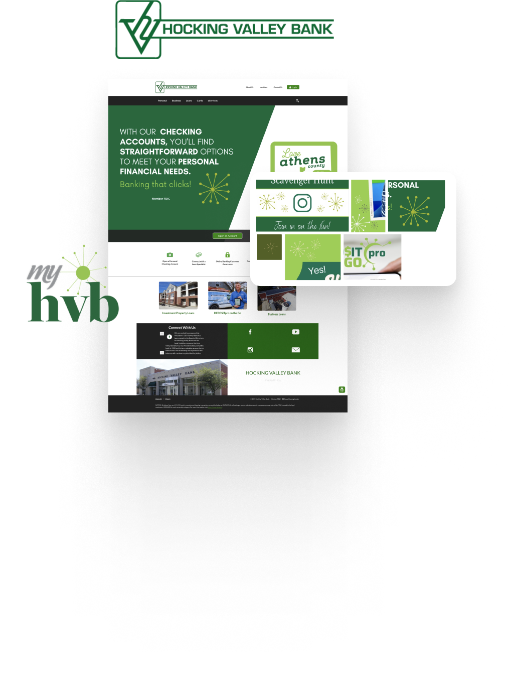
Hocking Valley Bank's original brand was not showcasing who they are as a bank or as people. Frankly, it was dated. Internally they were trying to add life to the existing brand, but these attempts were just complicating their identity further. It was time for a change.
Logo mark
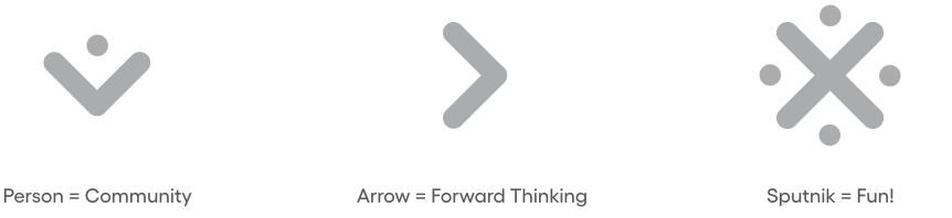
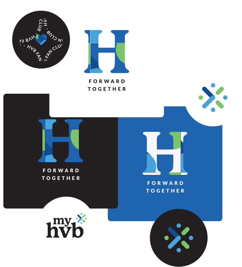
Hocking Valley Bank has a vibrant company culture, and they needed a logo to match. They had three descriptors in mind that they hoped to highlight with their new mark – community focused, forward thinking, and fun! Drawing inspiration from their existing mid-century sputnik design element, we created their new brandmark with the goal of symbolizing their unique passions.

Brand language
Hocking Valley Bank needed a versatile branding system, usable in different areas, regions, platforms, and events, all with room to grow in the future. We focused on creating a strong tagline that would be marketable and memorable, along with building out a variety of logomarks and badges for use across social media.
color palette
To complement their new branding approach, we put together a reimagined color palette for Hocking Valley Bank that felt modern and bold while maintaining a clear sense of their identity. To ensure it would work well for all their customers in all necessary contexts we chose colors that support ADA conformance.

typography system
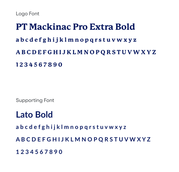
We chose PT Mackinac Pro Extra Bold as the primary font for Hocking Valley Bank's new logo – its bold, rounded, approachable appearance worked well as a modern take on the serif font that was being used as part of their original branding. To round out their new type system, we chose Lato Bold as a supporting font.
To help modernize the brand and bring consistency across materials we implemented Roboto as a supporting font.
Brand Application
Finally, we brought all the new branding elements together and put them to the test with a range of brand application examples. These included signage, merchandise, print materials, and social media designs.
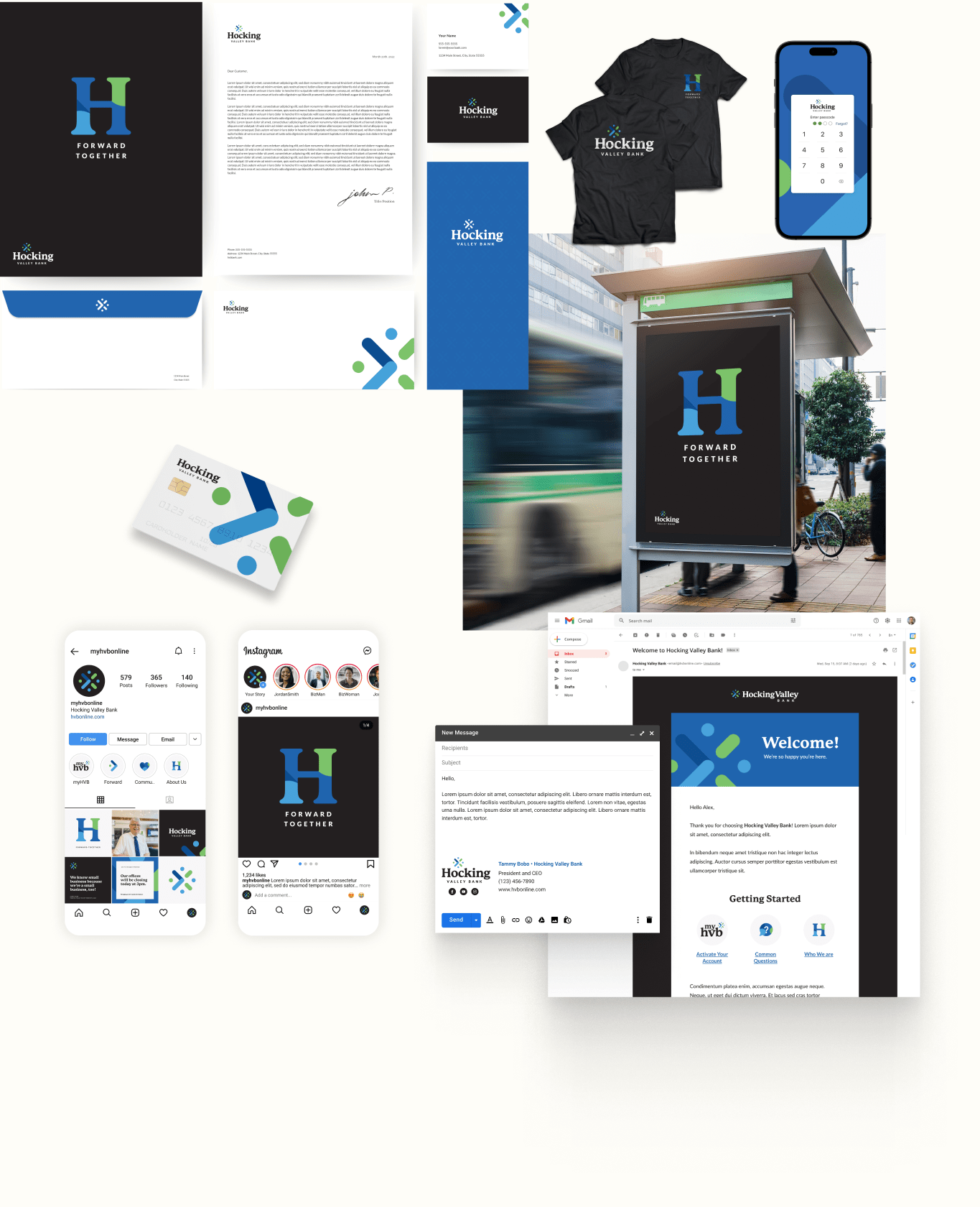

Note: These are theoretical brand applications. Our team does not implement physical design application, but encourages you to work with your local marketing or print agencies, supplying everything they'll need.
Brand Guidelines
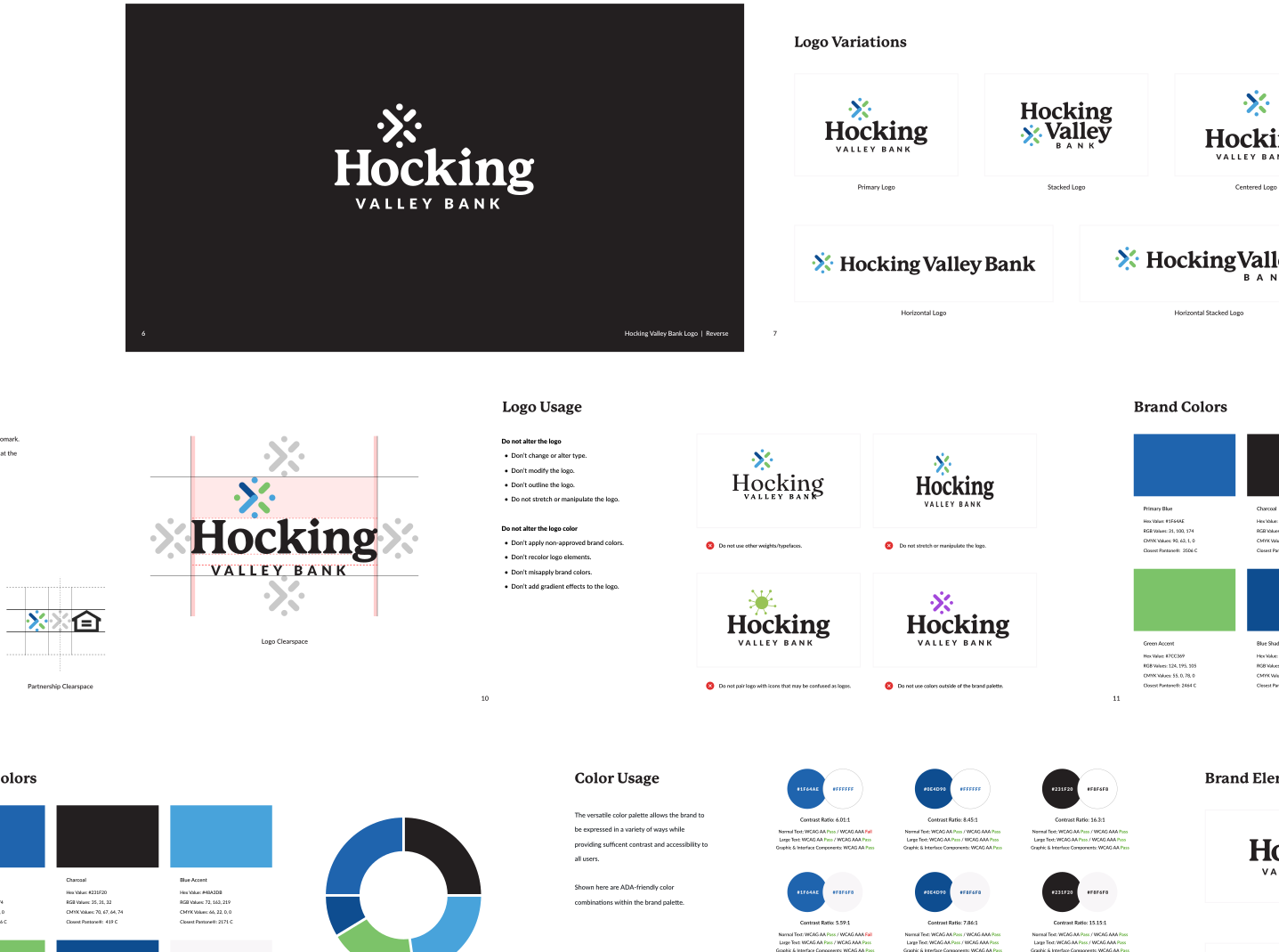
As a final deliverable, we provided Hocking Valley Bank with a full branding guidelines document to ensure they would be able to use their new brand to its full potential.
Better Together
a fresh website for your new brand
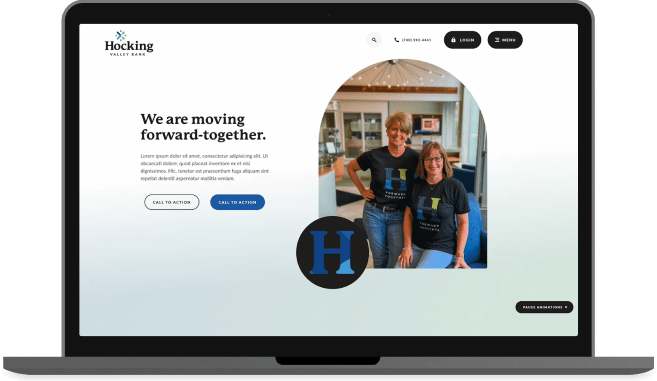
In addition to this branding project, we worked with Hocking Valley Bank to build a beautiful custom website – the perfect way to showcase their new identity.
I can't thank you enough for going above and beyond. This logo truly elevates our bank - it's sophisticated and fun - we're a small bank in southeast Ohio but the logo you created for us "screams" regional/national brand.